How to Customize Label Names and Inputs in Easy Form Builder for a Seamless User Experience
Discover the power of customization in Easy Form Builder as we guide you through the process of enhancing your form inputs. By customizing label names, hiding labels, changing description text, making inputs required, and adjusting various visual aspects, you can create a seamless and visually appealing user experience. Let’s explore the step-by-step process to personalize your form inputs and optimize submission rates.
- Field Setting
- Changing the label Text
- Hiding Label
- Changing the Description Text
- Required
- Changing the Placeholder
- Changing the Label size
- Changing the Label Color
- Changing the Description Color
- Changing the Field Color
- Changing the Border Color
- Min Length
- Max Length
- Label Position
- label Align
- description Align
- Width
- Height
- Corners
- Default value
- CSS Classes
- Disabled Field
- Hidden Field
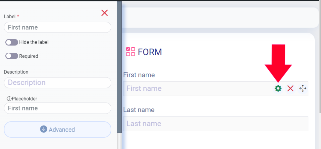
Field Setting
To start customizing your form inputs, access the field settings of your form. This is where you can change various features of the inputs to align with your desired design and functionality.
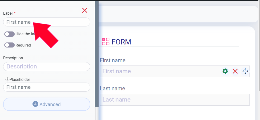
Changing the Label Text
Easily modify the label text by removing the existing content and entering the new text. Simply press Enter to apply the changes instantly.
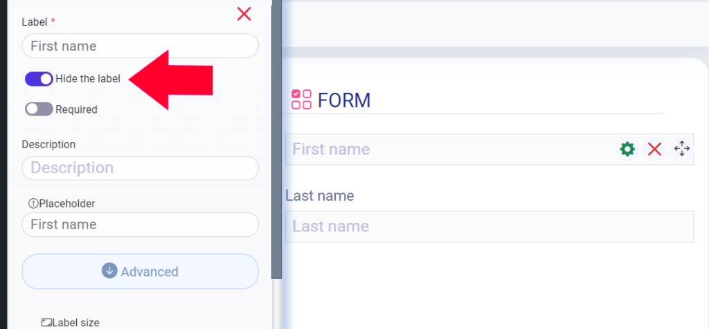
Hiding Label
For a more minimalist design, you have the option to hide labels. This feature allows you to create a cleaner form layout that focuses solely on the input fields.
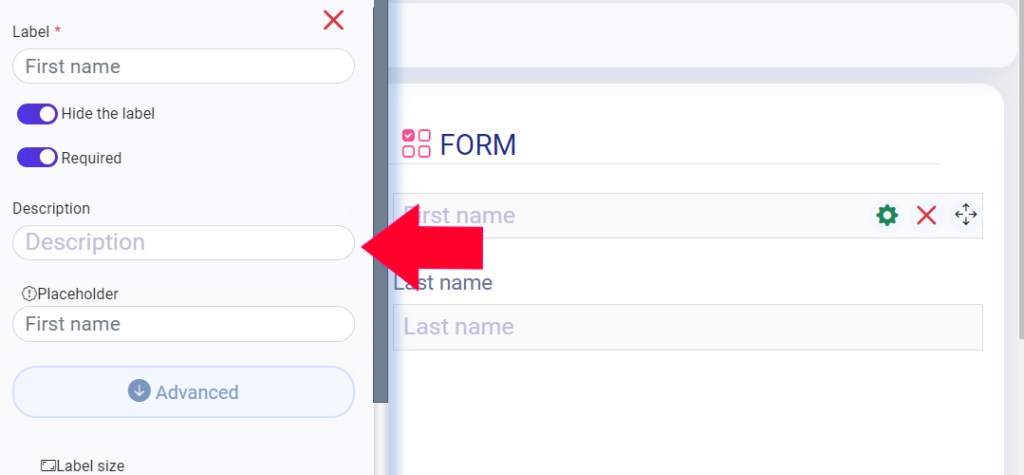
Changing the Description Text
Tailor the description text to provide clear instructions or additional information. Update the existing text by removing it and typing in your desired description. Press Enter to save the changes.
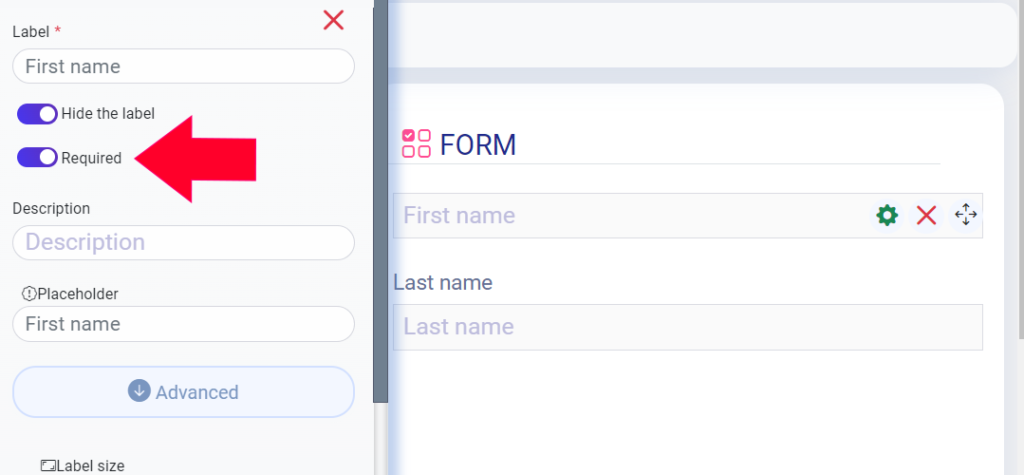
Required Field
Ensure user input by marking specific fields as required. When this option is selected, users must fill in the corresponding input to proceed.
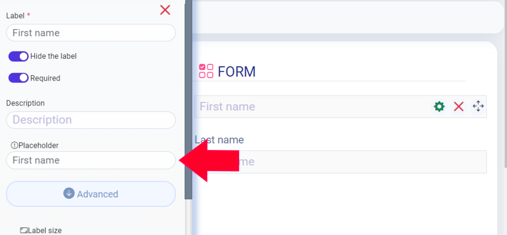
Changing the Placeholder
Personalize the placeholder text within the input fields by replacing the default text with your preferred wording. Press Enter to save the updated placeholder text.
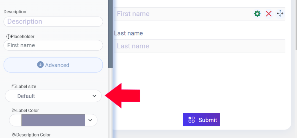
Changing the Label size
Resize the labels according to your visual preferences. Choose from a range of options, including Default, Small, Large, Xlarge, and XXlarge.
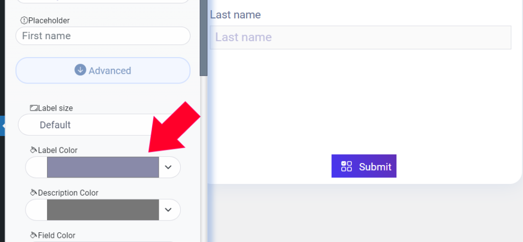
Changing the Label Color
Bring visual harmony to your form by customizing the label color. Simply click on the color field and select your desired color to create a cohesive design.
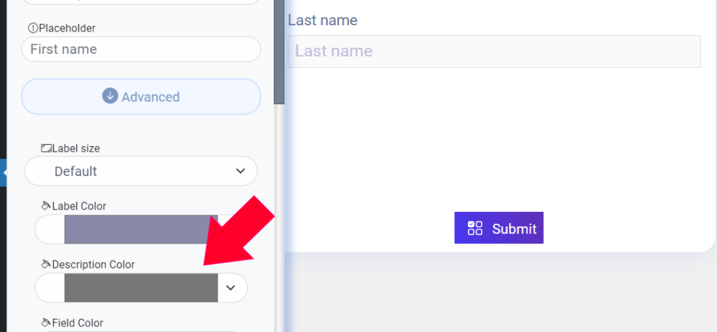
Changing the Description Color
Similar to label colors, you can also modify the description text color to match your overall aesthetic. Select your preferred color from the color field to achieve the desired look.
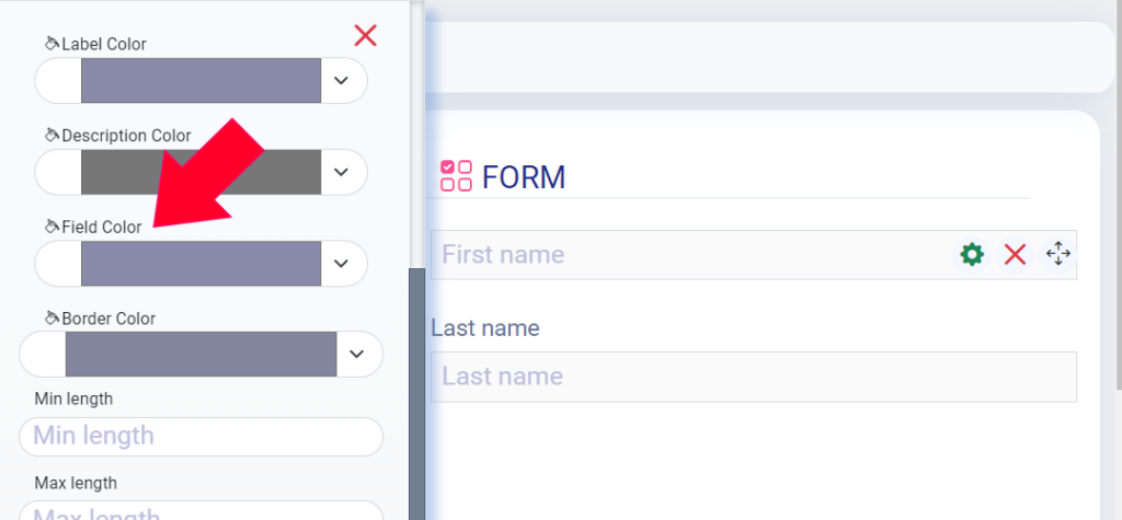
Changing the Field Color
Harmonize the input fields with the rest of your form by changing the field color. Choose a color that complements your design and enhances the user experience.
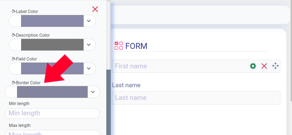
Changing the Border Color
Further refine the appearance of your form inputs by modifying the border color. Select the desired color from the available options to create a polished look.
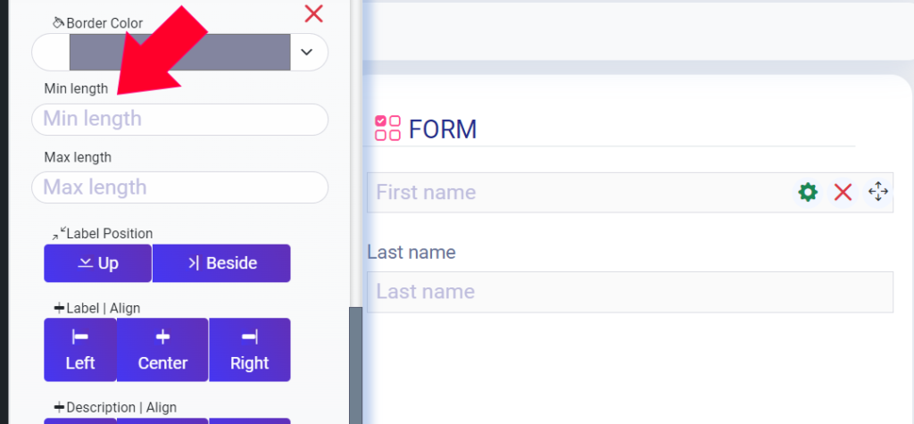
Min Length
Enter the desired minimum value count in the designated field. For example, if you want to require a minimum of 5 values (characters) , enter “5” in the input box.
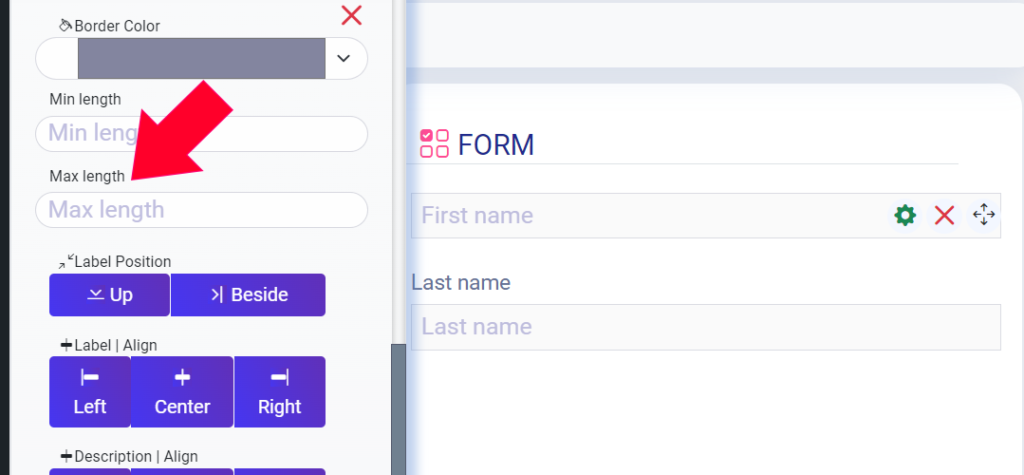
Max Length
Enter the desired maximum value count in the designated field. For example, if you want to require a maximum of 10 values (characters), enter “10” in the input box.
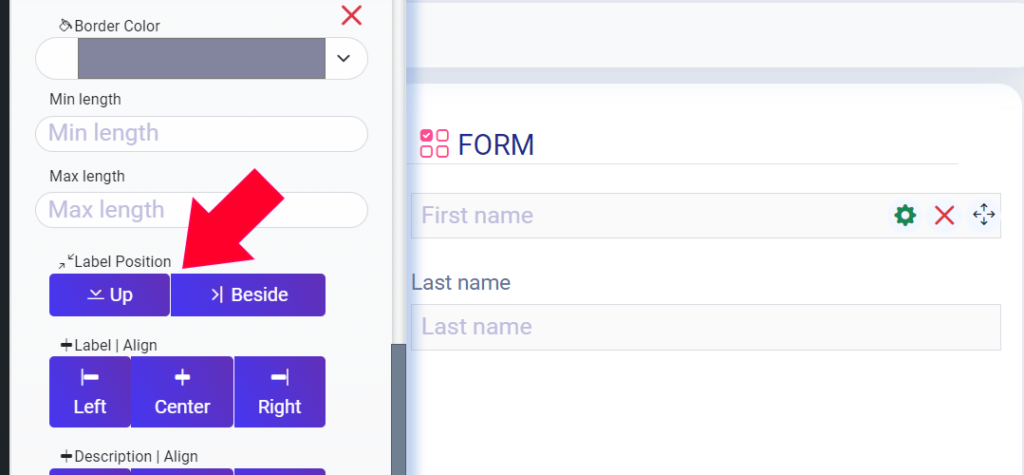
Label Position
Experiment with different label positions to optimize the form’s layout. Choose between displaying labels above or beside the input fields.
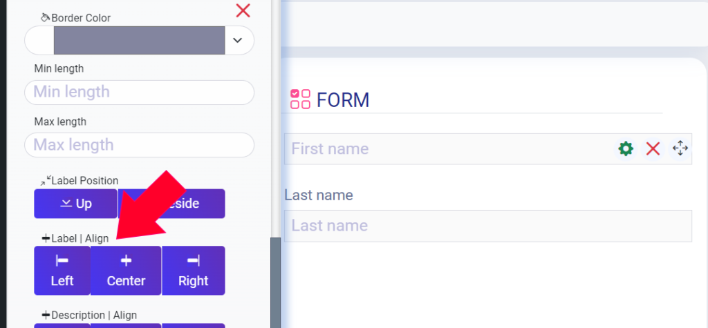
Label Align
Align the labels to the left, center, or right of the input fields to create a visually balanced form design.
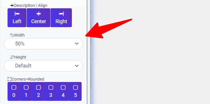
Description Align
Similarly, align the description text to the left, center, or right to maintain consistency in the form’s visual presentation.
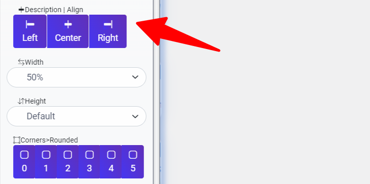
Width
Adjust the width of your input fields to suit your layout preferences. Choose from options such as 8%, 17% , 25% , 33%, 42%, 50%, 58%, 67%, 83%, 92% or 100% to achieve the desired form width.
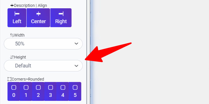
Height
Modify the height of your input fields based on your design requirements. Select from options like Default, Large, XX-large, or XXX-large to optimize the form’s appearance.
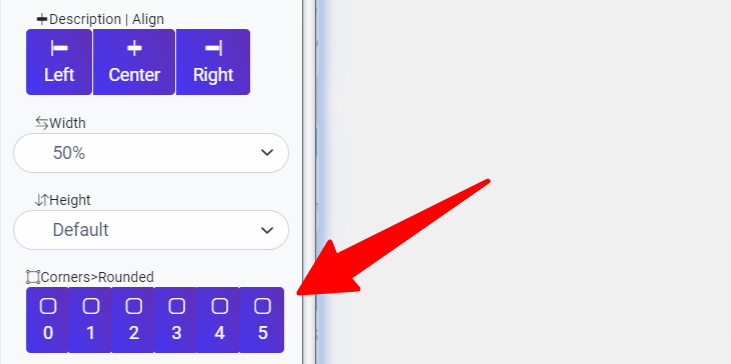
Corners
Customize the corners of your input fields to achieve the desired visual effect. Choose between range number from Square(0) to Rounded (5) shapes to match your design style.
Default value
Pre-fill input fields with default values using this option. Enhance user convenience by providing suggested content or instructions within the input fields.
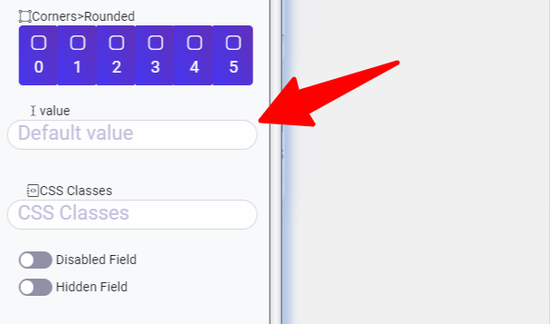
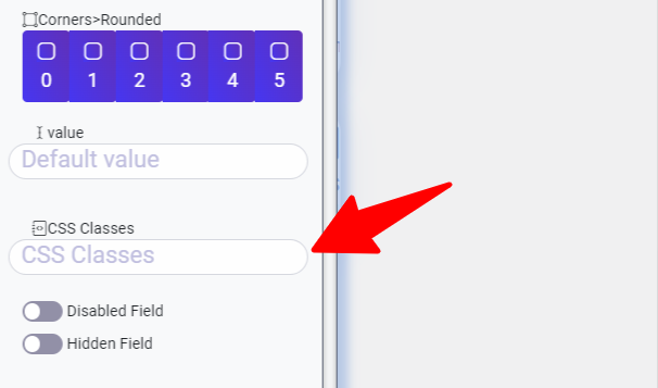
CSS Classes
for apply your css in the filed added to the css classes input
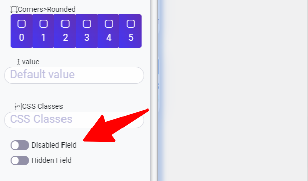
Disabled Field
When you activate the disabled field option in Easy Form Builder, users are unable to change the default value or any previously inputted values. This feature is particularly useful when certain form fields require a fixed value or should not be modified by users.
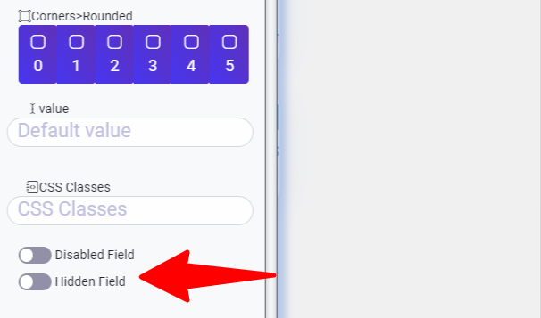
Hidden Field
The hidden field option allows you to conceal specific form elements from users while still capturing and transmitting the values to the backend. This feature is useful when you need to include certain data fields that are not relevant or should not be visible to users.
What more do you expect? Hurry up, start with Easy Form Builder right now!
 WhiteStudio.team